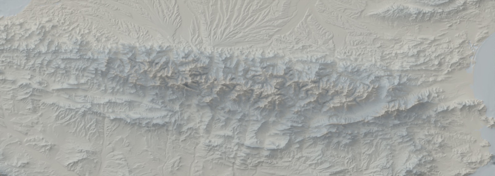
Archive · 2016–2026

Work

All projects: investigations, explainers, trackers and the open-source tools I make to support them. Filter by type, year or topic.

48/48 projects

Relievo CLI project banner 2026

Personal publication ·

Relievo: automated shaded relief maps from the command line

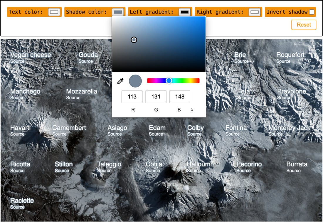
Relievo is a CLI that automates Daniel Huffman's Blender shaded-relief workflow end to end: DEM download or local input, reprojection, processing, headless rendering, color relief, clipping, and GIS-ready exports.

tool
Cheesy Shadow Picker v2 2026

Personal publication ·

Cheesy Shadow Picker v2

A major new version of Cheesy Shadow Picker: from a simple shadow list to a full ai2html editing workspace with drag-and-drop import, live preview controls, artboard-aware behavior, and production-ready CSS export.

tool
A week of war in Iran: mapping the escalation and response 2026

El País ·

A week of war in Iran: mapping the escalation and response

A breaking-news map explainer produced in a day and a half that summarizes one week of war around Iran, from strikes and retaliation to proxy activity and pressure points near the Strait of Hormuz.

explainer
Inset Map Creator 2026

Personal publication ·

Inset Map Creator

A practical utility to build editorial inset maps with Globe or Region modes, align them to a main map view, and export clean SVG output for Illustrator and ai2html workflows.

tool
Hormuz under threat: tanker traffic and chokepoints 2026

El País ·

Hormuz under threat: tanker traffic and chokepoints

A rapid-response map explainer on the Strait of Hormuz, showing how tanker traffic patterns shift under blockade threats and what that means for Gulf exports and Europe.

explainer
Aragon election results, street by street 2026

El País ·

Aragon election results, street by street

A live election map for Aragon at census-section level, with street-by-street results, party filters, and comparisons with 2023.

tracker
Real-Time Global Air Traffic Visualization 2025

GitHub ·

Real-Time Global Air Traffic Visualization

A lightweight GitHub Actions workflow captures near-real-time global aircraft positions, making it possible to reconstruct events such as sudden airspace closures during conflicts.

tool
2025

El País ·

What Ukraine would lose by ceding occupied territory

This explainer maps what is at stake in occupied Ukrainian territory, combining front-line evolution with strategic assets such as infrastructure, resources, and energy nodes.

explainer
Paiporta under water: reconstructing a deadly flood 2024

El País ·

Paiporta under water: reconstructing a deadly flood

Based on extensive field measurements, this project reconstructs the peak flood level in Paiporta and nearby towns, showing the full magnitude of a water mass that exceeded three meters in many streets.

investigation
Ukraine war fronts after the Kursk offensive 2024

El País ·

Ukraine war fronts after the Kursk offensive

A map-driven explainer on the Kursk offensive, contrasting Ukrainian advances inside Russia with simultaneous Russian gains in Donetsk through a clear temporal and territorial reading.

explainer
Hamas Resurges in Gaza Areas That Israel Considered Dismantled 2024

El País ·

Hamas Resurges in Gaza Areas That Israel Considered Dismantled

This project documents how armed activity reappeared in parts of Gaza that had been presented as dismantled, connecting military operations, territorial control, and civilian impact through map-based chronology.

explainer
Mapbox inset map 2024

Observable ·

Mapbox inset map

A very interesting utility to build inset maps for Mapbox scenes that include bearing and pitch, solving a gap where no native option exists.

tool
Scaling artboards for ai2html 2024

Observable ·

Scaling artboards for ai2html

A tiny utility to calculate the exact scale ratio between ai2html artboards, helping map and graphics workflows move faster in Adobe Illustrator.

tool
2023

El País ·

The coming floods: DANA, storms, and medicanes

This explainer links DANAs, Mediterranean cyclones, and medicanes through a real recent case, showing why extreme rainfall events in the region are becoming more destructive.

explainer
Poisson Disc Generator 2023

Observable ·

Poisson Disc Generator

Interactive generator for Poisson-disc point clouds with rectangle and circle modes, export options, and controls tuned for newsroom graphics workflows.

tool
Why Did the Tenerife Wildfire Spread So Rapidly? 2023

El País ·

Why Did the Tenerife Wildfire Spread So Rapidly?

A fast-turnaround wildfire explainer that uses terrain, vegetation, and wind context to show why the Tenerife fire spread so aggressively in a very short time.

explainer
How a major wildfire is fought 2023

El País ·

How a major wildfire is fought

A reconstruction of wildfire containment strategy in Catalonia, showing how real-time operational data, tactical decisions, and terrain constraints shaped the response under pressure.

investigation
2023

Personal publication ·

The center of the world crumbles like a cookie

A long-form visual explainer on Antarctic ice change that combines satellite-derived elevation data, cartographic experimentation, and narrative graphics to show where the continent is gaining or losing ice mass.

explainer
La Palma volcano: tunnels, caves, and devastation 2022

El País ·

La Palma volcano: tunnels, caves, and devastation

This piece examines the post-eruption volcanic tube system in La Palma and quantifies how much new material was deposited, linking subsurface structures to the transformed surface landscape.

explainer
2022

El País ·

Russian ghost ships to steal grain in Ukraine

This investigation traces vessels linked to grain extraction from occupied Ukrainian territories, documenting evasion patterns such as AIS shutdowns and opaque route behavior.

investigation
Melilla border tragedy: step by step 2022

El País ·

Melilla border tragedy: step by step

A forensic reconstruction of the Melilla border tragedy based on geolocated videos, witness accounts, and synchronized timelines to establish a verifiable sequence of events.

investigation
La Palma eruption: how to read the warning signs 2021

El País ·

La Palma eruption: how to read the warning signs

This explainer interprets key eruption indicators in La Palma—seismicity, tremor, and deformation—to clarify what each signal suggests about volcanic evolution and near-term risk.

explainer
Mexico has 30% of its land under high seismic risk 2021

Personal publication ·

Mexico has 30% of its land under high seismic risk

Authorities risk's maps reveal that one third of the population is exposed to high or very high levels of seismic hazard. Researchers analyze the risks to prevent the probable damage of a major earthquake in the country.

explainer
Daily COVID-19 evolution in Spain by region 2021

El País ·

Daily COVID-19 evolution in Spain by region

A continuously updated COVID-19 tracker for Spain that consolidated national and regional indicators into a single view for fast, reliable public consultation.

tracker
Three.js Learning: Building Interactive 3D Experiences 2021

Personal project ·

Three.js Learning: Building Interactive 3D Experiences

A learning project built while completing Bruno Simon's Three.js Journey, with interactive 3D prototypes focused on scene composition, lighting, and real-time interaction.

learning
The death of the last glaciers in Spain 2021

El País ·

The death of the last glaciers in Spain

A long-form visual story on the retreat of Spain's last glaciers, combining field reporting, scientific measurement, and 3D cartography to show how fast high-mountain ice is disappearing.

explainer
Spain's mortality map at unprecedented detail 2020

El País ·

Spain's mortality map at unprecedented detail

An unprecedented high-resolution mortality map of Spain that lets readers explore major causes of death at municipal scale while preserving statistical context and territorial comparability.

analysis
2020

El País ·

Europe, a continent of coalitions far beyond Spain

A comparative analysis of coalition governments across 38 European countries, showing that multiparty agreements are a structural norm rather than an exceptional political outcome.

explainer
How to Merge CSV headers in R. An approach 2019

Personal publication ·

How to Merge CSV headers in R. An approach

A practical R workflow for cleaning statistical spreadsheets with double headers, turning messy official tables into analysis-ready tidy data.

tutorial
2019

Personal publication ·

How I covered Spain's 2019 general elections for RTVE

Project developed by Datadista showcasing their coverage of the 2019 general elections for RTVE, the state-owned public corporation responsible for Spain's radio and television services. The project includes scatter charts, cartograms, and numerous maps.

case-study
Transparentia: search engine for politicians' salaries 2019

Personal publication ·

Transparentia: search engine for politicians' salaries

Transparentia lets you to check more than 9.600 salaries of politicians and public workers. We wanted to answer a simple question: how many politicians are there in Spain and how much are they paid.

tool
The power of remote sensing and its application to the media 2017

Personal publication ·

The power of remote sensing and its application to the media

Exploring remote sensing through an analysis of two practical applications of the Difference Normalized Burn Index, focusing on the assessment of the severity of two major fires in Spain using Landsat 8 imagery.

case-study
ai2html workshop 2016

GitHub ·

ai2html workshop

Workshop about ai2html imparted at Medialab Prado in Madrid. Ai2html is an Adobe Illustrator plugin for publishing responsive graphics developed at The New York Times.

tutorial
GIS should be a must in newsrooms 2016

Personal publication ·

GIS should be a must in newsrooms

A course about the basic principles of cartography and GIS I gave to data journalism students at the University of Villanueva, in Madrid.

case-study