Supertankers stalled and a new Iran-controlled route in Hormuz
Context
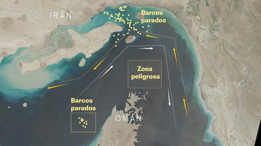
This project was built as a rapid visual analysis to explain how maritime traffic changed in and around the Strait of Hormuz, where supertankers started queueing while a new Iran-controlled corridor emerged.
My role
- Cartography
- Data analysis
- Frontend development
I worked on cartographic framing, vessel-data interpretation, and frontend implementation, shaping the map narrative so route constraints and waiting patterns were immediately legible.
Data and methodology
The analysis combined satellite imagery and navigation data to map vessel positions, identify queue concentrations, and compare route behavior across both sides of the strait.
We structured the piece as a concise visual explainer, prioritizing fast reading, geographic precision, and direct annotation of high-impact traffic shifts.
For part of the terrain and rendering workflow, I tested an early phase of Relievo, a project I am developing and will present in more detail soon.
Key decisions
- We prioritized a map-first sequence so readers could quickly locate where traffic was stalling and how route control evolved.
- Visual hierarchy was simplified for mobile to preserve legibility in dense maritime scenes with many nearby vessel positions.
- Annotations were kept short and positional to connect geographic bottlenecks with concrete operational consequences for tanker movement.
Result
The final piece translated a fast-changing maritime disruption into a clear geographic narrative, making queue formation and route control changes understandable at a glance.
Impact and learnings
- The project reinforced a reusable breaking-news workflow for maritime explainers where satellite evidence, traffic data, and map clarity must come together under tight deadlines.