Ukraine war fronts after the Kursk offensive
Context
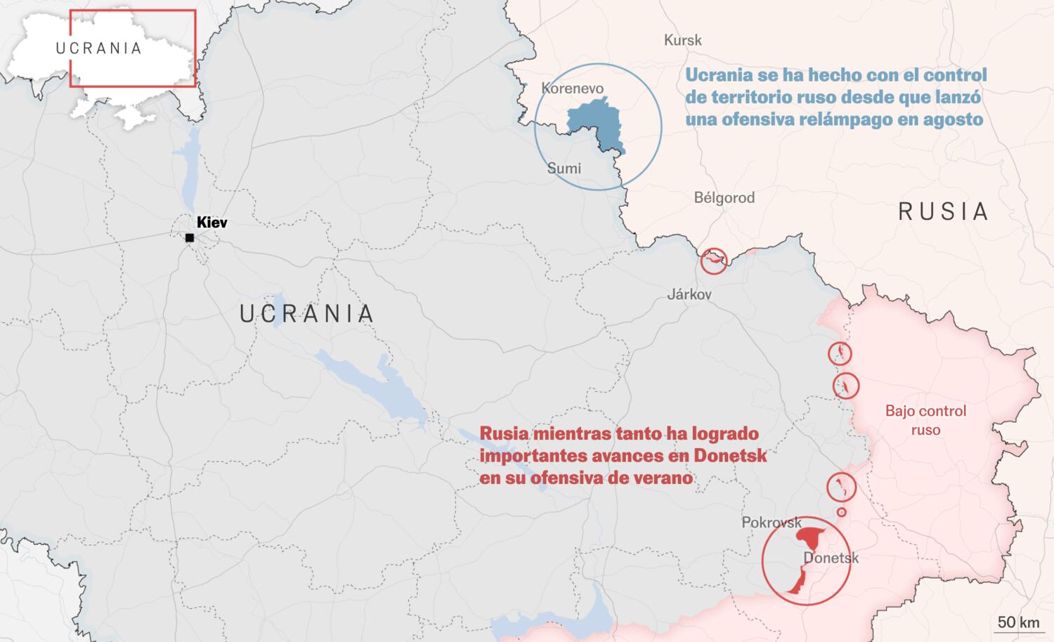
This map-driven explainer tracks how front lines shifted after the start of the Kursk offensive, contrasting Russian gains in Donetsk with Ukrainian positions across the border. I focused on temporal cartography and visual hierarchy so readers could compare movement over time without getting lost in tactical detail.
My role
- Cartography
- Data analysis
I led the cartographic design and visual execution, with special focus on map hierarchy, color decisions, and typographic clarity so movement over time could be compared without tactical overload.
Data and methodology
As in other war-front pieces, we worked from ISW front-line data and coordinated editorial decisions with Javier Galan throughout production.
The structure combined a high-level strategic overview with a detailed regional map of Kursk and a complementary chart to quantify gains and losses since the start of the conflict.
Key decisions
- We opened with a strategic framing: Ukrainian gains in Kursk occurred in parallel with notable Russian advances in Donetsk, so both dynamics had to be read together.
- After the overview, we moved to a detailed Kursk map to anchor place-based understanding before presenting comparative quantitative evidence.
- The bar-chart module was treated as a narrative device, not only a metric display, to reinforce territorial shifts in a direct and memorable way.
Result
The final piece delivered a concise but information-dense visual package in which maps and charting worked together to explain a fast-moving military context.
Impact and learnings
- The article performed well and confirmed that a restrained visual language can still communicate conflict dynamics with high clarity.
- It reinforced the value of pairing careful cartographic design with simple but narrative-minded charts in war coverage.