Spain's mortality map at unprecedented detail
Context
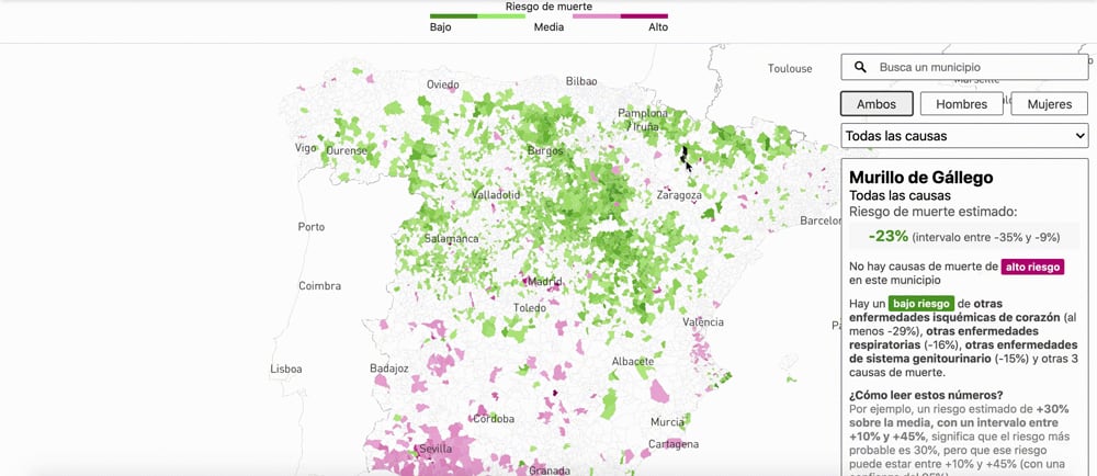
This project presents high-resolution mortality patterns across Spain using a large historical dataset of deaths. The cartographic and visual design was aimed at revealing geographic inequality clearly, allowing readers to compare territories without losing statistical meaning.
My role
- Cartography
- Frontend development
My main contribution was the cartographic layer and dashboard design, translating a complex national dataset into a consultable and readable public interface.
Data and methodology
The project was developed with the data desk, which coordinated directly with the scientific team behind the underlying mortality research.
The workflow focused on turning a large analytical dataset into an explorable territorial product, with municipal granularity and consistent visual interpretation across Spain.
Key decisions
- We prioritized comparability and statistical meaning over visual ornament, so readers could move between territories without misreading scale or relevance.
- The product was structured as a map-plus-dashboard system to combine spatial exploration with clear cause-of-death summaries.
- Special attention was paid to information design hierarchy because this was one of my first major Mapbox projects and clarity was critical to public use.
Result
The final piece enabled nationwide and local consultation of mortality patterns with a level of territorial detail not previously available in this format.
Impact and learnings
- The project helped bring a significant scientific study to a broad audience through an interface designed for real consultation, not just one-time reading.
- It was also a key milestone in my Mapbox practice and reinforced how central information design is in data-heavy public tools.