Four years of war in Ukraine: a front that barely moves
explainer
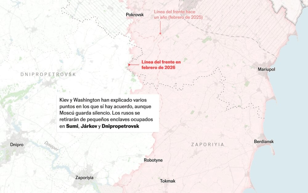
stack: [qgis, ai2html]
Context
A map-based four-year overview of the war in Ukraine, focused on front-line changes, territory control, and key conflict indicators.
My role
- Cartography
- Data analysis
- Frontend development
I led the cartographic and visual implementation, shaping map hierarchy, temporal comparisons, and mobile-first readability in close coordination with the newsroom team.
Data and methodology
The piece combines front-line data, territorial change estimates, infrastructure attack records, aid flows, and casualty figures in one visual package.
We structured the article as a sequence of complementary maps and charts to move from macro territorial dynamics to energy, financing, and human impact.
Key decisions
- We prioritized temporal comparison across 2022-2026 to make the slowdown in territorial changes explicit.
- We used map-plus-chart storytelling to avoid a single-indicator reading of the war and preserve geopolitical context.
- Visual hierarchy was tuned for fast scanning so readers could connect military, economic, and humanitarian dimensions in one pass.
Result
The final piece provides a clear visual summary of four years of war.
Impact and learnings
- The project helps maintain a consistent format for periodic conflict updates.