From war to your home: how conflict scrap feeds steel
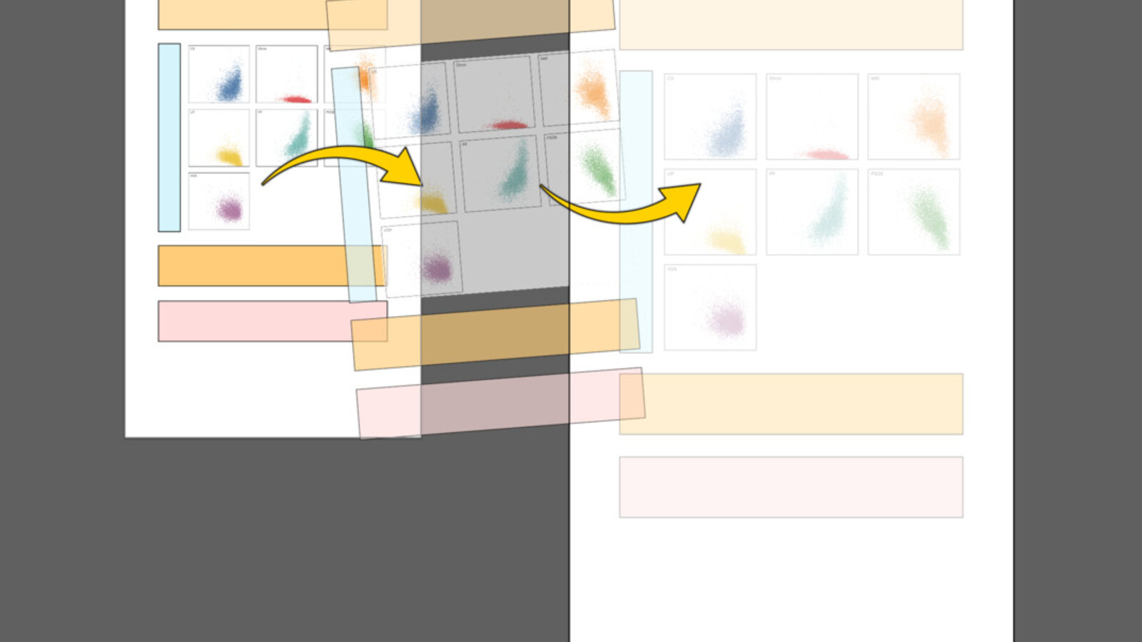
A cross-border investigation maps how war scrap from Syria, Libya, and Ukraine enters Turkish steel production and returns to Europe as finished products.
investigation
Visual Journalism, Cartography and Tools
Here I collect newsroom stories, independent projects, and open-source tools and experiments.
01
A cross-border investigation maps how war scrap from Syria, Libya, and Ukraine enters Turkish steel production and returns to Europe as finished products.
 2026
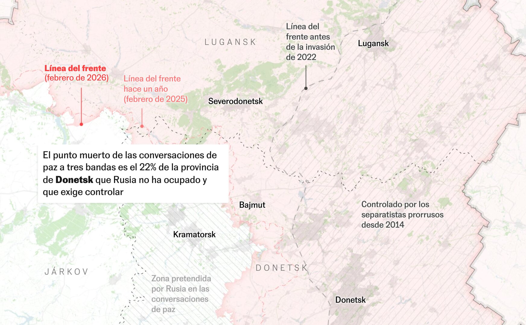
2026 A map-based four-year balance of the war in Ukraine, showing a largely stalled front, energy infrastructure attacks, aid shifts, and the human cost of the conflict.
A hydraulic simulation reconstructs the Rambla del Poyo flood minute by minute, showing three core findings: the event was predictable, devastating, and extremely fast.
A long-form visual explainer on Antarctic ice change that combines satellite-derived elevation data, cartographic experimentation, and narrative graphics to show where the continent is gaining or losing ice mass.
 2022
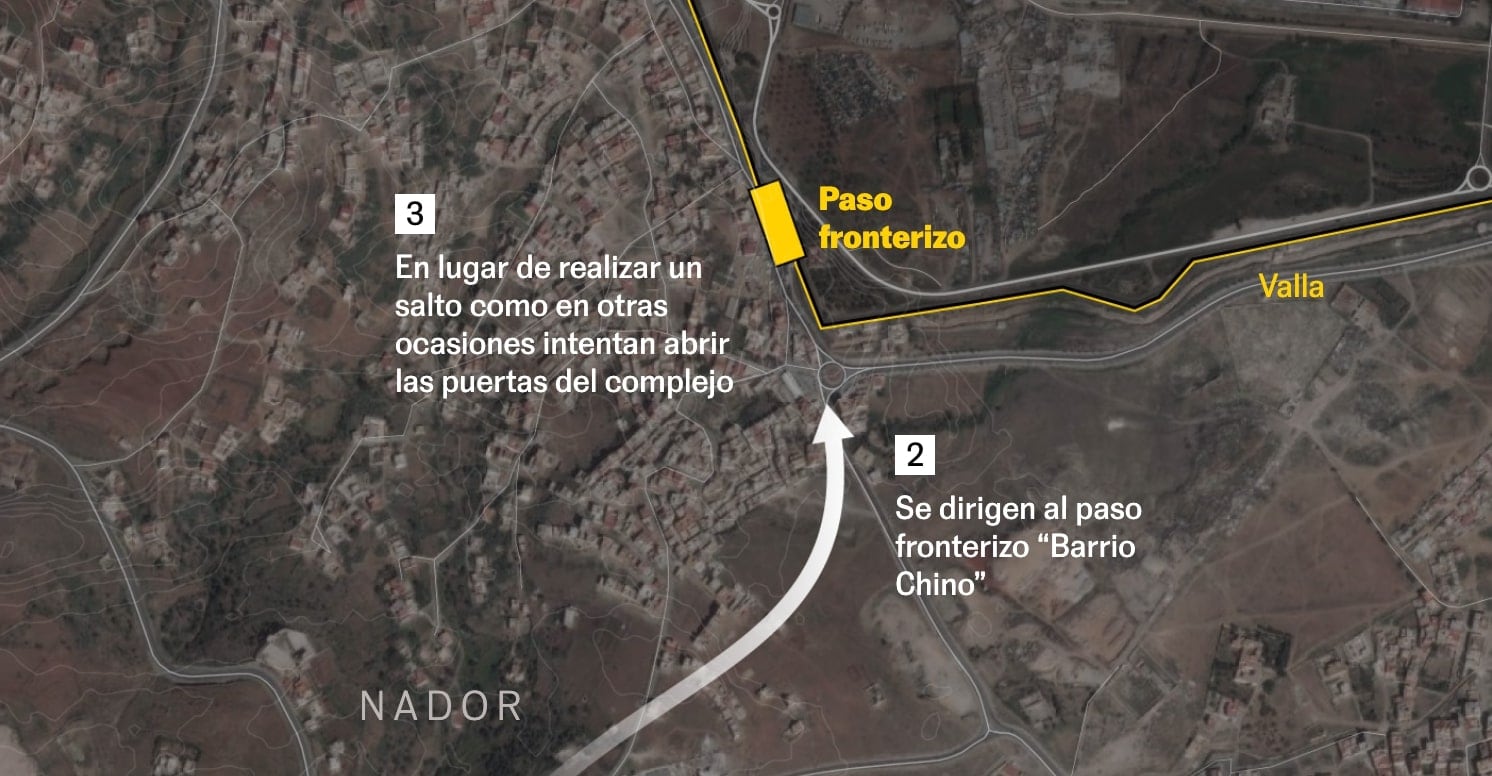
2022 A forensic reconstruction of the Melilla border tragedy based on geolocated videos, witness accounts, and synchronized timelines to establish a verifiable sequence of events.
02
 2026
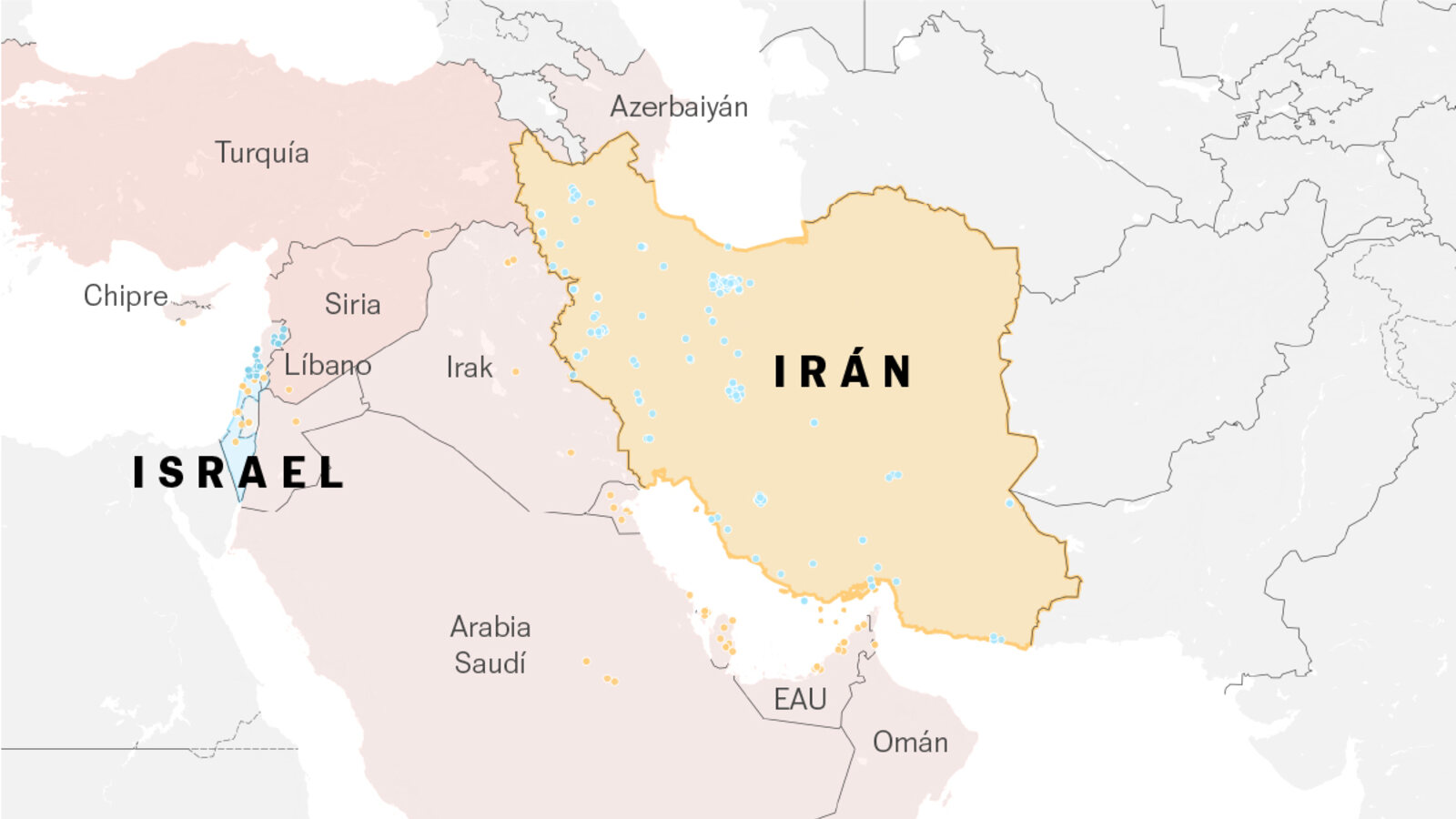
2026 A breaking-news map explainer produced in a day and a half that summarizes one week of war around Iran, from strikes and retaliation to proxy activity and pressure points near the Strait of Hormuz.
 2026
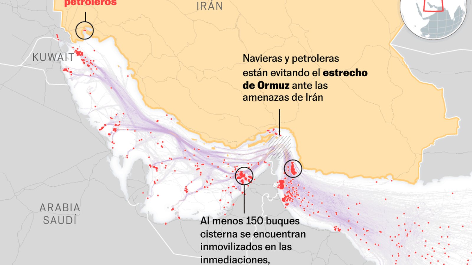
2026 A rapid-response map explainer on the Strait of Hormuz, showing how tanker traffic patterns shift under blockade threats and what that means for Gulf exports and Europe.
 2026
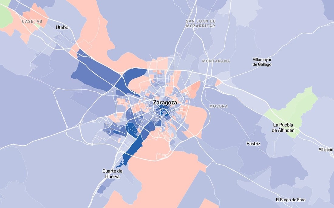
2026 A live election map for Aragon at census-section level, with street-by-street results, party filters, and comparisons with 2023.
 2025
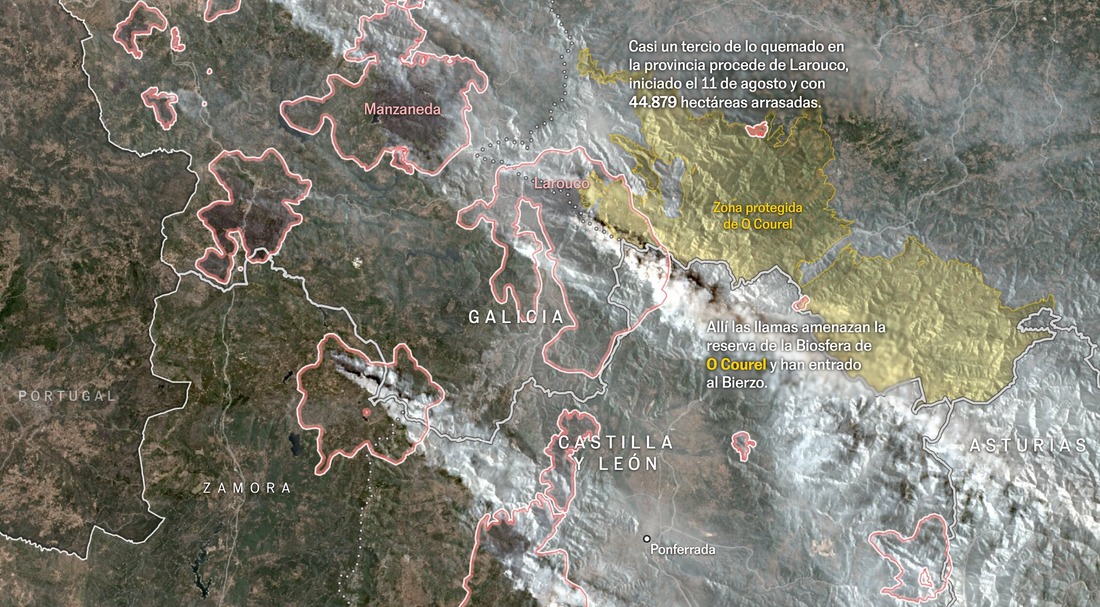
2025 A visual summary of Spain's most severe 2025 wildfire weeks, combining burned-area perimeters, regional impact, and air-quality deterioration.
 2024
2024 Based on extensive field measurements, this project reconstructs the peak flood level in Paiporta and nearby towns, showing the full magnitude of a water mass that exceeded three meters in many streets.
 2024
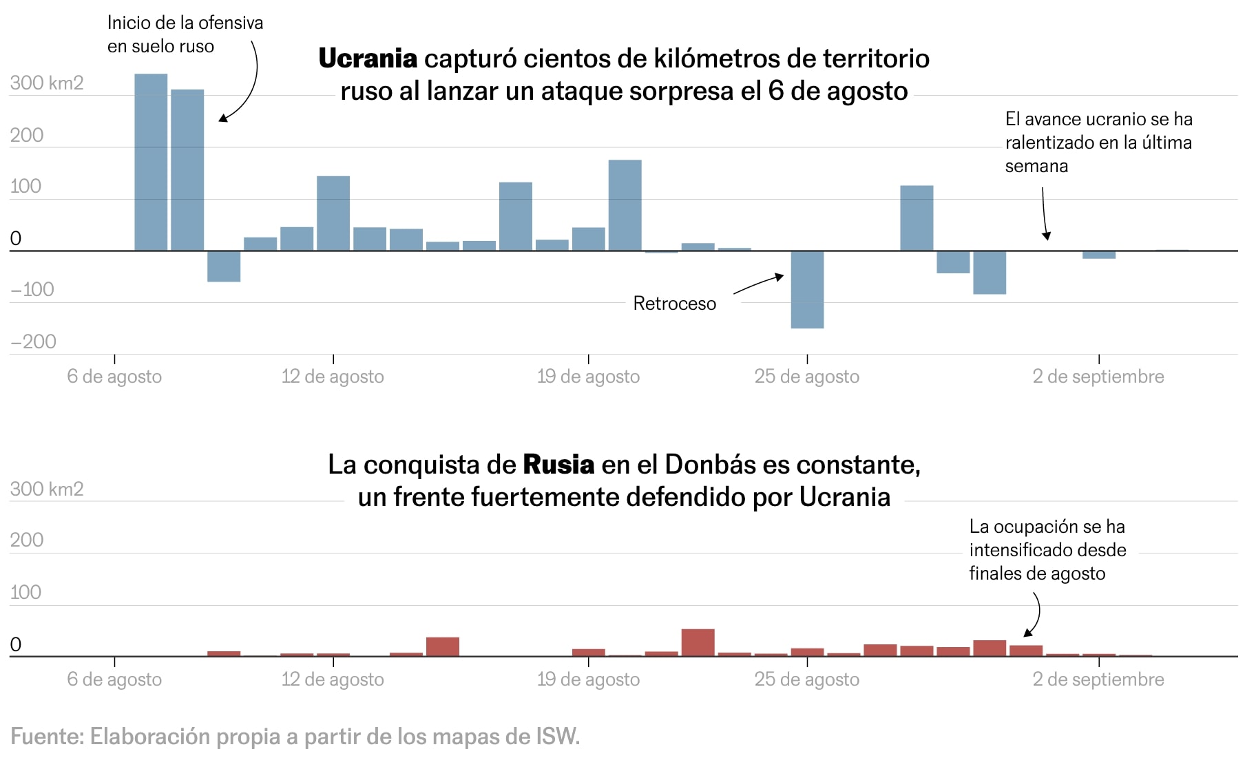
2024 A map-driven explainer on the Kursk offensive, contrasting Ukrainian advances inside Russia with simultaneous Russian gains in Donetsk through a clear temporal and territorial reading.
03
 2026
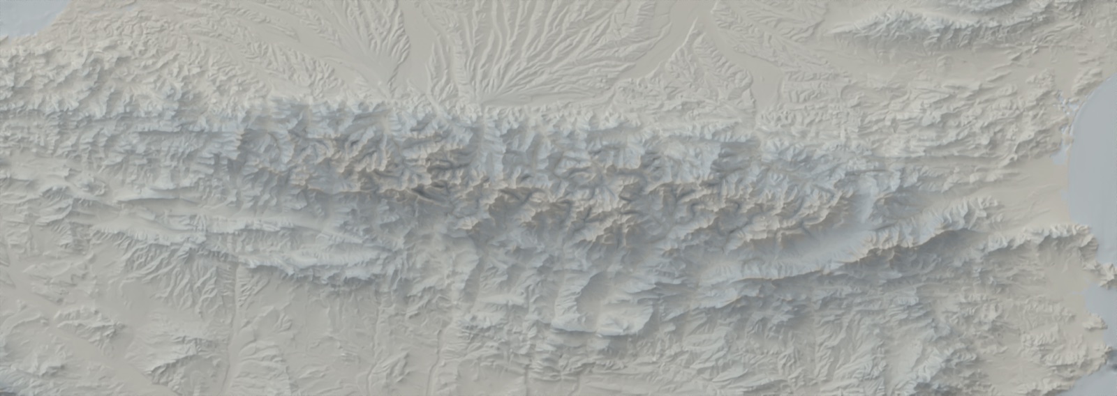
2026 Relievo is a CLI that automates Daniel Huffman's Blender shaded-relief workflow end to end: DEM download or local input, reprojection, processing, headless rendering, color relief, clipping, and GIS-ready exports.
 2026
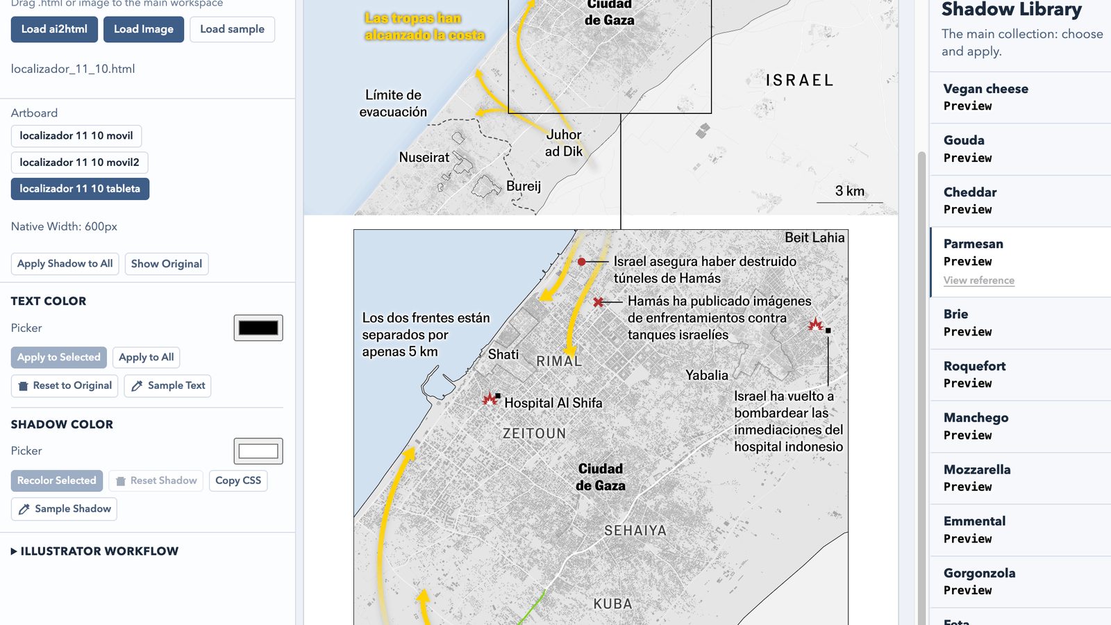
2026 A major new version of Cheesy Shadow Picker: from a simple shadow list to a full ai2html editing workspace with drag-and-drop import, live preview controls, artboard-aware behavior, and production-ready CSS export.
 2024
2024 A very interesting utility to build inset maps for Mapbox scenes that include bearing and pitch, solving a gap where no native option exists.
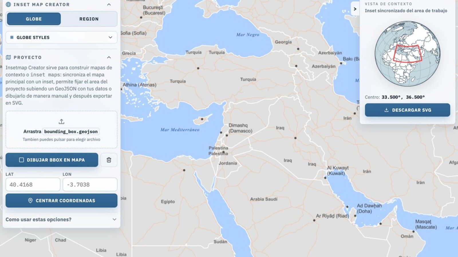 2026
2026 A practical utility to build editorial inset maps with Globe or Region modes, align them to a main map view, and export clean SVG output for Illustrator and ai2html workflows.
 2024
2024 A tiny utility to calculate the exact scale ratio between ai2html artboards, helping map and graphics workflows move faster in Adobe Illustrator.
 2016
2016 A course about the basic principles of cartography and GIS I gave to data journalism students at the University of Villanueva, in Madrid.