Predictable, devastating and very fast: what the simulation of the flooding of the Rambla del Poyo reveals
In late October 2024, a DANA storm dropped more than 200 liters of rain per square meter over the province of Valencia in just a few hours. The consequences were catastrophic: hundreds of lives lost and a landscape devastated by the force of the water—especially in the southern metropolitan area, where the Rambla del Poyo, an apparently harmless dry streambed, turned into a deadly trap.
Thanks to a hydrodynamic simulation developed by a research team at the Universitat Politècnica de València, the visual journalism team from El País gained access to an unprecedented model: a minute-by-minute reconstruction of how the floodwaters advanced from the ravine into neighborhoods like Picanya, Xirivella, and the outskirts of Valencia.
This interactive visualization was a challenge both technically and narratively. Our main goal was to convey to readers the extraordinary nature of the flood: how protective systems collapsed, and how official alerts came far too late. The simulation makes it clear that by the time the warning reached the population, much of the area was already under more than 1.5 meters of water.
The key component of the project is the scroll. Readers control the simulation as if scrubbing through a video: scrolling down advances the timeline, scrolling up rewinds it. This effect is achieved by interpolating between coordinates and zoom levels.
The Data Source
The UPV researcher shared with us the raw simulation files in HDF format. Structurally similar to NetCDF, these files contained water-level values and flood extent data across both space and time.
Optimizing Mapbox Performance: Combining Vector Tilesets for Smooth Layer Animation
Since we had a “snapshot” of the flood every ten minutes, we faced the challenge of representing 80 time steps without overwhelming the browser.
Our first attempt used georeferenced PNGs, but the result was disappointing: layers flickered when toggled on and off, especially while panning the map. We then considered using GeoTIFFs, but uploading more than 80 of them to Mapbox Studio was simply unfeasible.
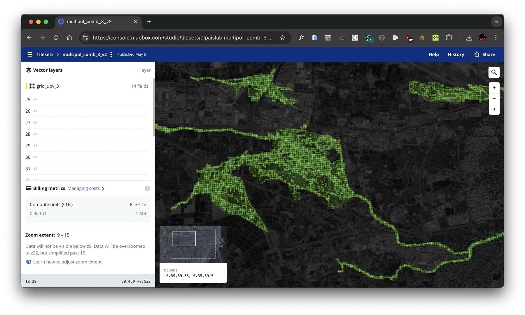
The solution was to vectorize the GeoTIFFs and turn them into vector tilesets. We grouped the GeoTIFFs into eight tilesets (each containing 10–15 time steps), and within each we merged adjacent cells with the same value, dissolving unnecessary geometries to reduce file size. This allowed us to work with lighter layers and deliver a smooth experience.
How to Animate Layers in Mapbox Using Scroll-Driven Interaction
After several iterations, we found a workflow that worked seamlessly. As the reader scrolls, the visualization needs to recolor cells for the corresponding timestamp. At the same time, the system must switch tilesets—up to eight times throughout the sequence without the reader noticing.
The animation relies on a simple but effective trick: instead of constantly loading and unloading data, all tileset layers are added to the map at the beginning, though they remain invisible. Each layer corresponds to a chunk of the simulation. When the animation reaches a new timestamp, the sequence is as follows:
- Activate the new layer → make the relevant chunk visible and color its cells using the defined scale.
- Reorder the display → bring that layer to the foreground, above reference layers on the map.
- Synchronize with rendering → wait until Mapbox finishes drawing the new layer to ensure it never appears incomplete.
- Fade out the previous layer → once rendering is complete, reduce the opacity of the old layer to zero with a smooth transition.
- Update internal references → record the new layer as the active one, ready for the next frame.
The result: only one layer is visible at a time, but transitions remain imperceptible. Each new layer is painted first, and only then is the previous one faded out, ensuring continuous, flicker-free animation—even when alternating between multiple tilesets.
function update(newFrame) {
  const record = timeStamps[newFrame];
  const currentT = record.t;
  const currentChunk = record.file_chunk;
  const activeLayerId = `tileset-layer-${currentChunk}`;

  // 1. Activate the new layer and paint it
  map.setLayoutProperty(activeLayerId, 'visibility', 'visible');
  map.moveLayer(activeLayerId, 'admin-0-boundary');
  updateTilesetFillColor(map, activeLayerId, currentT);
  updateTilesetFillOpacity(map, activeLayerId, currentT);

  // 2. If you change layers, wait and hide the previous one.
  if (activeLayerId !== currentLayer) {
    const layerToHide = currentLayer;
    map.once('idle', () => {
      updateTilesetFillOpacity(map, layerToHide, currentT, 0);
    });
    currentLayer = activeLayerId;
  }

  currentFrame = newFrame;
}
Conclusion
This project was a true technical challenge: not only because of the sheer volume of data—more than 400,000 cells, each with over 80 values—but also because of the need to transform that density into an experience that was both fluid and explorable. Achieving smooth scrolling, real-time responsiveness, and allowing readers to freely navigate the map required a careful combination of tileset optimization, color scaling, and precise control of Mapbox rendering. The result is a visualization that condenses a complex scientific model into an interactive narrative, one that captures the dynamics of a catastrophic flood without sacrificing accuracy or user experience.
You can take a look at the article here.