The center of the world crumbles like a cookie
This collaboration with our colleagues from Materia, the science section of El País, resulted in a most rewarding experience. Manuel Ansede and Claudio Álvarez had the opportunity to travel to the Antarctic continent accompanying a Chilean scientific mission. This group of scientists is studying the changes that are taking place in Antarctica, many of them appreciable on a human scale.
Pursuing the idea of presenting the Antarctic continent as a protagonist and fundamental actor in the balance of the planet, my colleague Ansede introduced me to a projection known as the Spilhaus Projection. This projection depicts all the seas of the planet as a single body of water with Antarctica in the center.
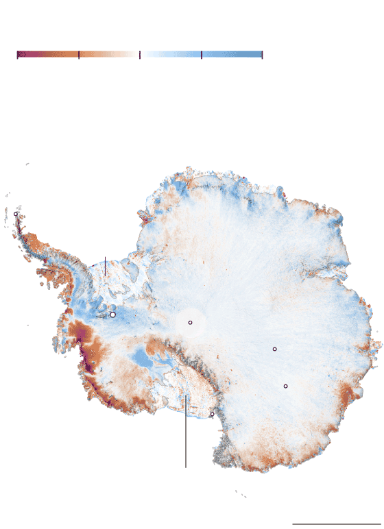
Tasa media de cambio (2018-2022)
Metros de espesor
–3 m
–0,25
0
0,25
3
Áreas que están
ganando espesor
Mar de Weddell
Base O’Higgins
Filchner-Ronne
Plataforma de hielo
Glaciar Unión
Polo Sur
Mar de
Amundsen
Base Vostok
Glaciar Thwaites
Base Concordia
Base McMurdo
Áreas que
están perdiendo
espesor
Ross
Plataforma de hielo
1.000 km
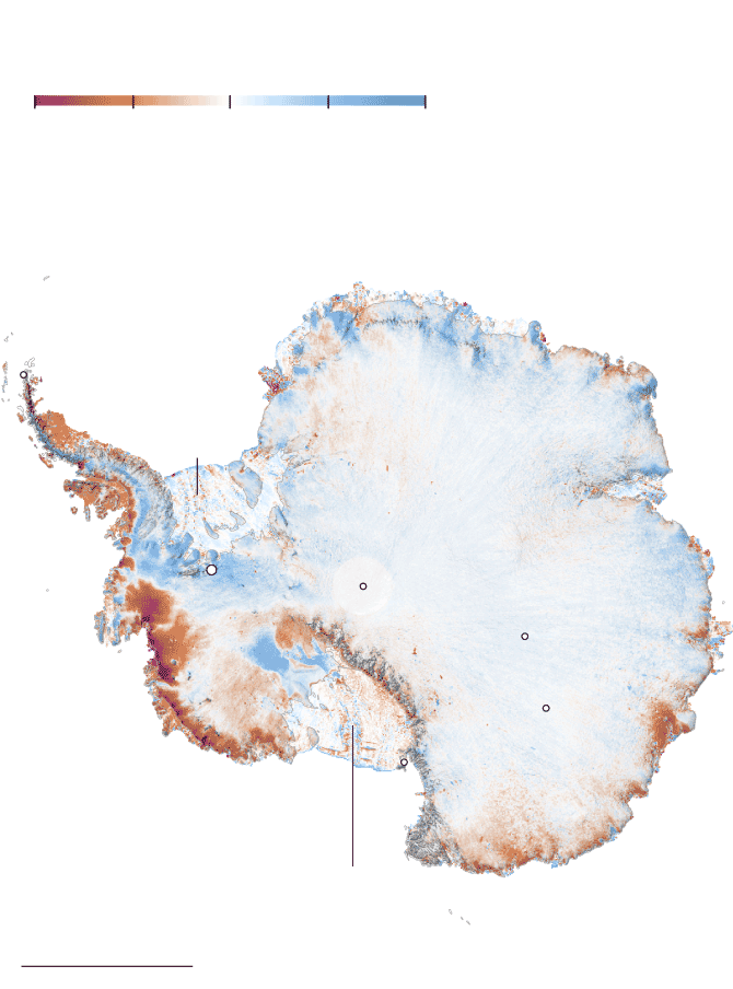
Tasa media de cambio (2018-2022)
Metros de espesor
–3 m
–0,25
0
0,25
3
Áreas que están
ganando espesor
Mar de Weddell
Base O’Higgins
Filchner-Ronne
Plataforma de hielo
Glaciar Unión
Polo Sur
Base Vostok
Glaciar Thwaites
Base Concordia
Base McMurdo
Áreas que
están perdiendo
espesor
Ross
Plataforma de hielo
1.000 km
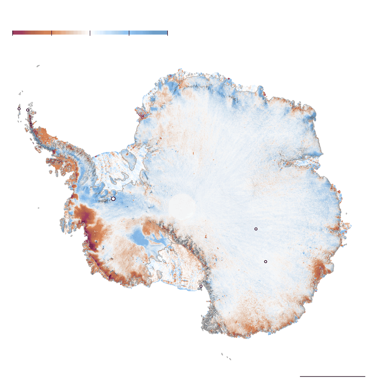
Tasa media de cambio (2018-2022)
Metros de espesor
–3 m
–0,25
0
0,25
3
Áreas que están
ganando espesor
Villa las
Estrellas
Base O’Higgins
Mar de Weddell
Filchner-Ronne
Plataforma de hielo
Glaciar Amery
Antártida
Este
Glaciar Unión
Polo Sur
Antártida
Oeste
Base Vostok
Glaciar Thwaites
Ross
Plataforma de hielo
Base Concordia
Áreas que
están perdiendo
espesor
Base McMurdo
Mar de
Ross
Mar de
Amundsen
1.000 km
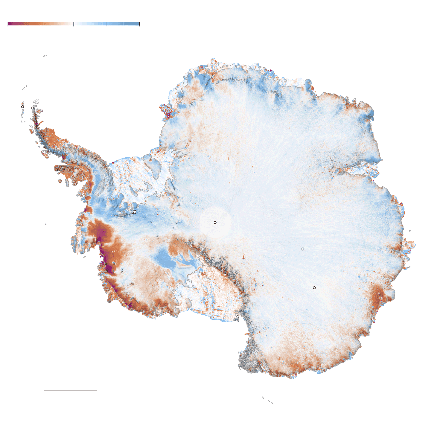
Tasa media de cambio (2018-2022)
Metros de espesor
–3 m
–0,25
0
0,25
3
Áreas que están
ganando espesor
Villa las
Estrellas
Base O’Higgins
Mar de Weddell
Filchner-Ronne
Plataforma de hielo
Glaciar Amery
Antártida
Este
Glaciar Unión
Polo Sur
Montes Ellsworth
Antártida
Oeste
Sin datos
Base Vostok
Glaciar Thwaites
Base Concordia
Áreas que están
perdiendo espesor
Ross
Plataforma de hielo
Base McMurdo
Mar de
Amundsen
Mar de
Ross
1.000 km
Initially, we were uncertain about the feasibility of using this projection. At that time, we had not yet determined how we would integrate it into our story, and such intricate projections are not always possible to produce with QGIS., the software we utilize for working with geographic data. After conducting research on this projection, we discovered that utilizing it in QGIS was indeed not feasible. It appeared that the most suitable approach was through d3js.
Once we conceptualized Antarctica as a regulating force of ocean currents, weather patterns, and temperatures through this projection, the challenge arose of visualizing the melting of Antarctica.
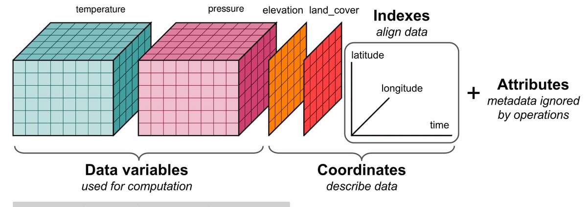
We are in luck. We have NASA’s ICESat-2 mission. This satellite carries a photon-counting laser altimeter that allows scientists to measure the elevation of ice sheets, glaciers, sea ice and more - all in unprecedented detail. The mission provides open access to its data in NetCDF format, designed for storing multidimensional scientific data such as climate, oceanographic, and atmospheric data, among others.
 https://web.itu.edu.tr/~tokerem/netcdf.html
The Data
NetCDF data is increasingly utilized by the scientific community but can be complex due to its extensive information and large file sizes (in this case, over 6.4 GB). Access to this dataset is available via the following link, and here is the description of the dataset. I recommend reviewing the documentation provided.
 https://nsidc.org/sites/default/files/documents/user-guide/atl15-v003-userguide_0.pdf
A bit of code
The approach taken with R involved obtaining a CSV file containing latitude/longitude coordinates and associated values for each point to depict changes in ice height and illustrate mass loss.
The steps involved in the R workflow were as follows:
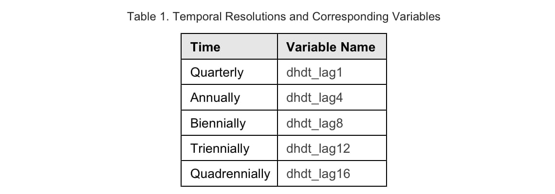
- Reading the raw ICESat-2 data.
- Calculating the mean using the more detailed data (lag1 ~ Quarterly).
- Generalizing the data with the ‘aggregate’ function from the Raster package.
- Polygonizing.
- Extracting the centroid of each polygon.
- Exporting the data.
We can now overlay the grid on our d3js globe.
The packages utilized in this process are listed below (some may not have been used extensively, as thorough verification was not possible).
library(glue)
library(sf)
library(ncdf4)
library(raster)
library(rasterVis)
library(RColorBrewer)
library(lubridate)
library(tidyverse)
library(janitor)
To find the best parameters to suit our needs I created a function to which I could pass different configurations:
generate_raster <-
  function(lag,
           crs_value,
           aggregate_factor,
           write_raster,
           write_shp
           ) {
    varname <- glue("dhdt_lag{lag}/dhdt")

    # extract data
    ice_change_raw <-
      brick(path, varname = varname)

    # assign projection
    crs(ice_change_raw) <- "EPSG:3031"

    # calculate mean
    print('Calculating mean...')
    mean_ice_change <- mean(ice_change_raw)

    # reduce cell size
    print('Aggregating values...')
    raster_aggregated <-
      aggregate(mean_ice_change, fact = aggregate_factor)

    if (write_raster == T) {
      print('Writing raster...')
      writeRaster(
        mean_ice_change,
        filename = glue("median_ice_change_dhdt_lag{lag}.tif"),
        overwrite = T
      )
    }

    # to shp
    print('Poligonizing...')
    poligonized <- rasterToPolygons(raster_aggregated)
    if(write_shp) {
      raster::shapefile(
        poligonized,
        glue(
          "poligonized_lag{lag}_aggregate_factor{aggregate_factor}.shp"
        ),
        overwrite = T
      )
    }

    # convert to simple features
    as_sf <- poligonized %>% st_as_sf()

    # extract centroids
    print('Calculating centroids...')
    centroids <- as_sf %>%
      st_centroid() %>%
      st_transform('EPSG:4326') %>%
      mutate(value = format(round(layer, 2), nsmall = 2),
             long = unlist(map(geometry, 1)),
             lat = unlist(map(geometry, 2)),
             long=format(round(long, 2), nsmall = 2),
             lat=format(round(lat, 2), nsmall = 2)
      ) %>%
      select(-layer) %>%
      st_drop_geometry()

    # write centroids
    st_write(
      centroids <- as_sf %>%
        st_centroid() %>%
        st_transform('EPSG:4326'),
      glue(
        "centroids_lag{lag}_aggregate_factor{aggregate_factor}.geojson"
      ),
      delete_dsn = T
    )

    # write cscv
    write_csv(
      centroids,
      glue("centroids_lag{lag}_aggregate_factor{aggregate_factor}.csv")
    )

    write_csv(
      centroids %>%
        filter(as.numeric(value) <= 0),
      glue("centroids_lag{lag}_aggregate_factor{aggregate_factor}_ice_lost.csv")
    )

  }
For our purposes, I used the funcion as follows:
generate_raster(1, "EPSG:4326", 25, TRUE, FALSE)
*2024 Update The latest version has split the continent into four separate files: two 1.6 GB files, one 1 GB file, and one 776 MB file.
Conclusions
I am pleased with the outcome of this project. The opportunity to confront various challenges along the way and overcome them is not always common in media, especially when delving into unfamiliar territory. Engaging with raw NASA data, working with it, making decisions on its utilization, and finding optimal methods for transforming it to extract valuable insights has been an enriching experience.
You can take a look at the article here.