How I covered the 2019 General Elections for the Spanish Radio and Television Corporation
This year I had the opportunity of get back to Media and make election charts again with d3js!. This time, Datadista give me the chance to create a full coverage of the Spanish General Elections (2019) with a multiple types of charts like maps, scatterplots or cartograms.
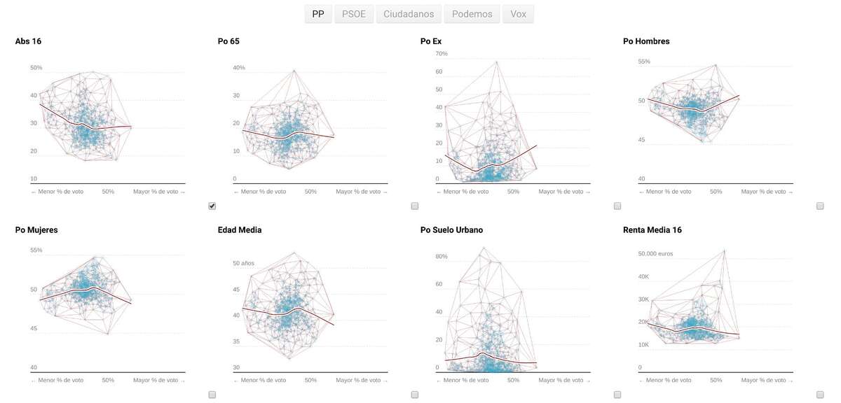
The coverage was a project for Spanish Public Television (RTVE) and during the previous weeks of the election we were launching a deeply analisis of the last General Election results (2016) and then we updated all the charts with the last results after the elections. The topics of the analysis were the cost of each vote, scatterplots to relate % of vote with several socioeconomic variables or a series of small multiples of maps such like participation or bipartidism. Up to approx. 2015, in Spain there was a bipartisan political scenario where the main weight of the electoral results was played by the two main parties. This situation began to be diluted as a result of the appearance of new parties.
Other kind of graph I did for the first time was a Cartogram with the Joseph Bailey’s georgeus geogrid R package.
Regards to each graphic, Scatterplots uses the new d3-regression by Harry Stevens and d3-delaunay for the tooltip interaction. There is no hidden Voronoi layer or anything else. It’s really powerful and fast!
 Capture of the delaunay path for the interaction (not visible in production).
Regrettably, SVG uses to be pretty slow when renders thousands of elements in browsers. Each scatterplot has over 800 points and there is 12 scatterplots. In order to improve the perfomance it was the first time I combine Canvas and SVG in a scatterplot. Even that, the results wasn’t as good as I expected so next time I should give a try to WebGL.
We created Winner Party maps but this time we relate the electoral results with the population density in order to create a more accurate map. A very high percentage of the Spanish population lives in the cities and their nearby areas, which creates a landscape that has received in recent years the adjective, debatable, of La España Vacía (The empty Spain).
This type of maps with interaction uses a combination of two layers too. The choropleth is drawn on the Canvas one and the hover path is drawn on the SVG layer.
Treemaps were used to show how many votes were needed to get one of the 350 seats of which the Spanish parliament is composed. You can navigate through all the spanish General Elections, from 1977 to 2019. The Spanish electoral system makes the vote not worth the same in all provinces and, in addition, penalizes minority parties of a national nature, and that is what this graph wants to highlight.
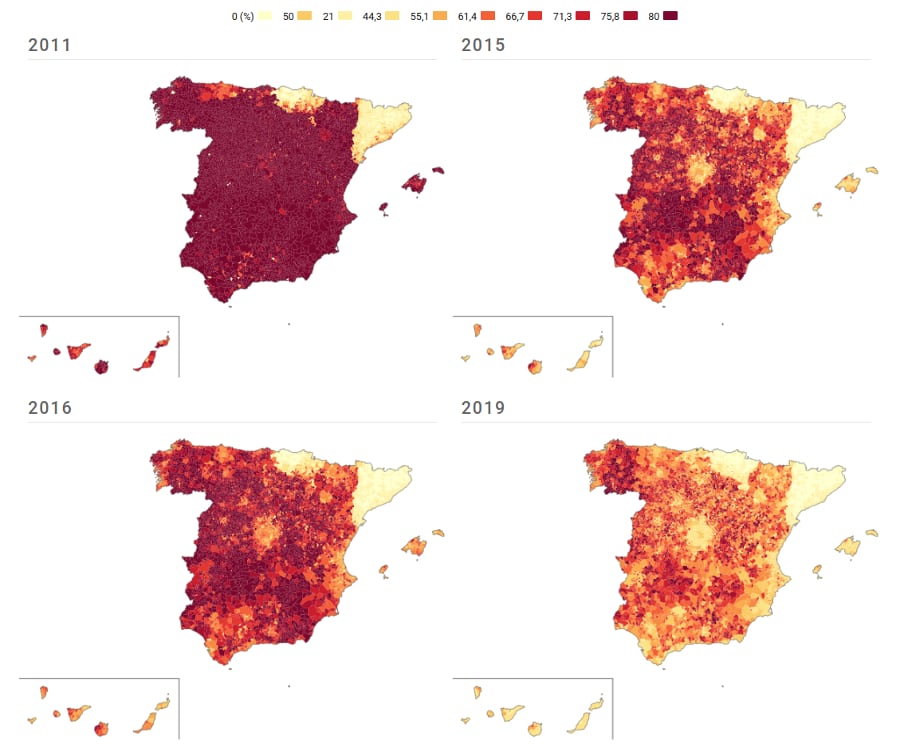
In Spain, when we talk about bipartidism when creating maps like the following, we usually paint the sum of the voting percentage of the two main parties, PP (Popular Party) and PSOE (Spanish Socialist Workers’ Party). This kind of visualization helps us to see pretty well the end of a political scenario. In this map, two outliers are clearly visible. There is a gap to this kind of vote in Catalonia (right) and the Basque Country (top) where the vote for nationalist parties has always been greater.
 Capture of small multiples of maps about the decline of bipartidism.