A week of war in Iran: mapping the escalation and response
Context
This project was conceived as a breaking-news explainer with a very tight deadline: to publish in roughly a day and a half a clear geographic summary of actors, events, and consequences across the region.
My role
- Cartography
- Data analysis
- Frontend development
I worked on the cartographic narrative, geospatial data integration, and frontend implementation of the scrollytelling experience, with special focus on mobile readability and framing control.
Data and methodology
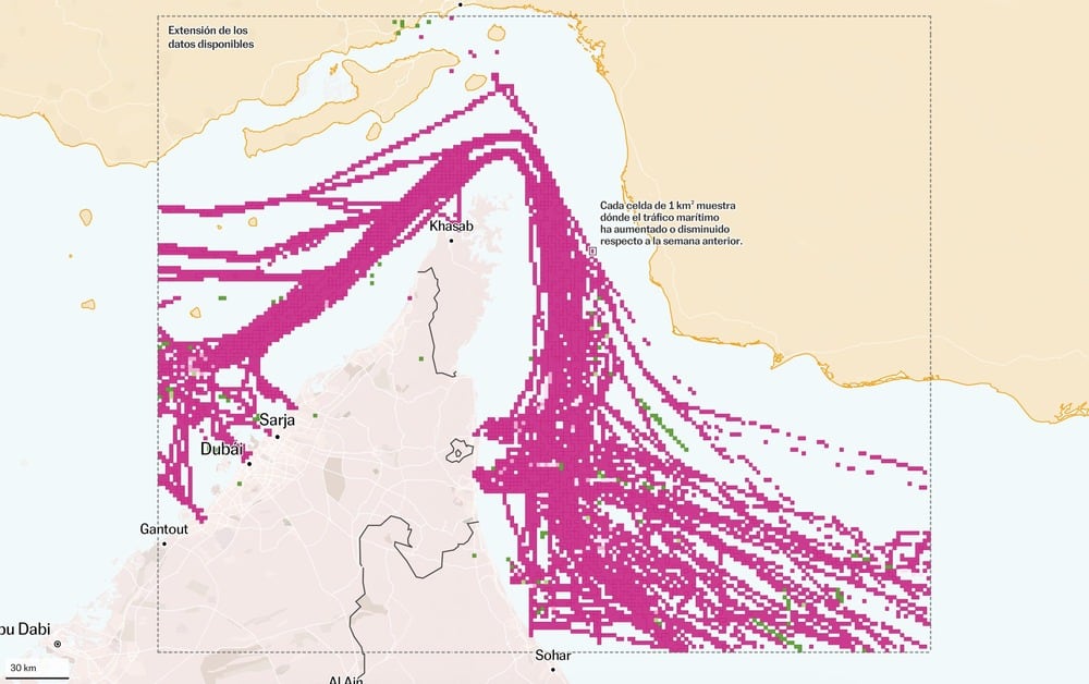
The story is structured as a sequence of map steps combining geolocated conflict events, country-level context, and maritime disruption indicators.
The implementation uses Svelte and Mapbox GL, with layer visibility and filtering controlled by scroll position to keep each scene focused and legible under a breaking-news production timeline.
Key decisions
- On mobile, we prioritized `bounds` over simple `center` camera logic to ensure every key geographic element remained inside the smartphone viewport at each step.
- We used Mapbox's globe projection to give a more realistic spatial perspective and reinforce that the conflict's effects extend beyond one local front.
- We carefully ordered the narrative and used few, very subtle camera changes so mobile reading felt smooth, digestible, and easy to follow despite the complexity of events.
Result
The final piece delivers a simple-to-read, map-first reconstruction of one week of conflict dynamics, placing actors, events, and consequences in one coherent geographic narrative.
Impact and learnings
- The project demonstrates a reusable workflow for rapid conflict explainers that balances strict deadlines with high mobile usability and narrative clarity.