How maps are made: flattening Earth and the Mercator problem
Context
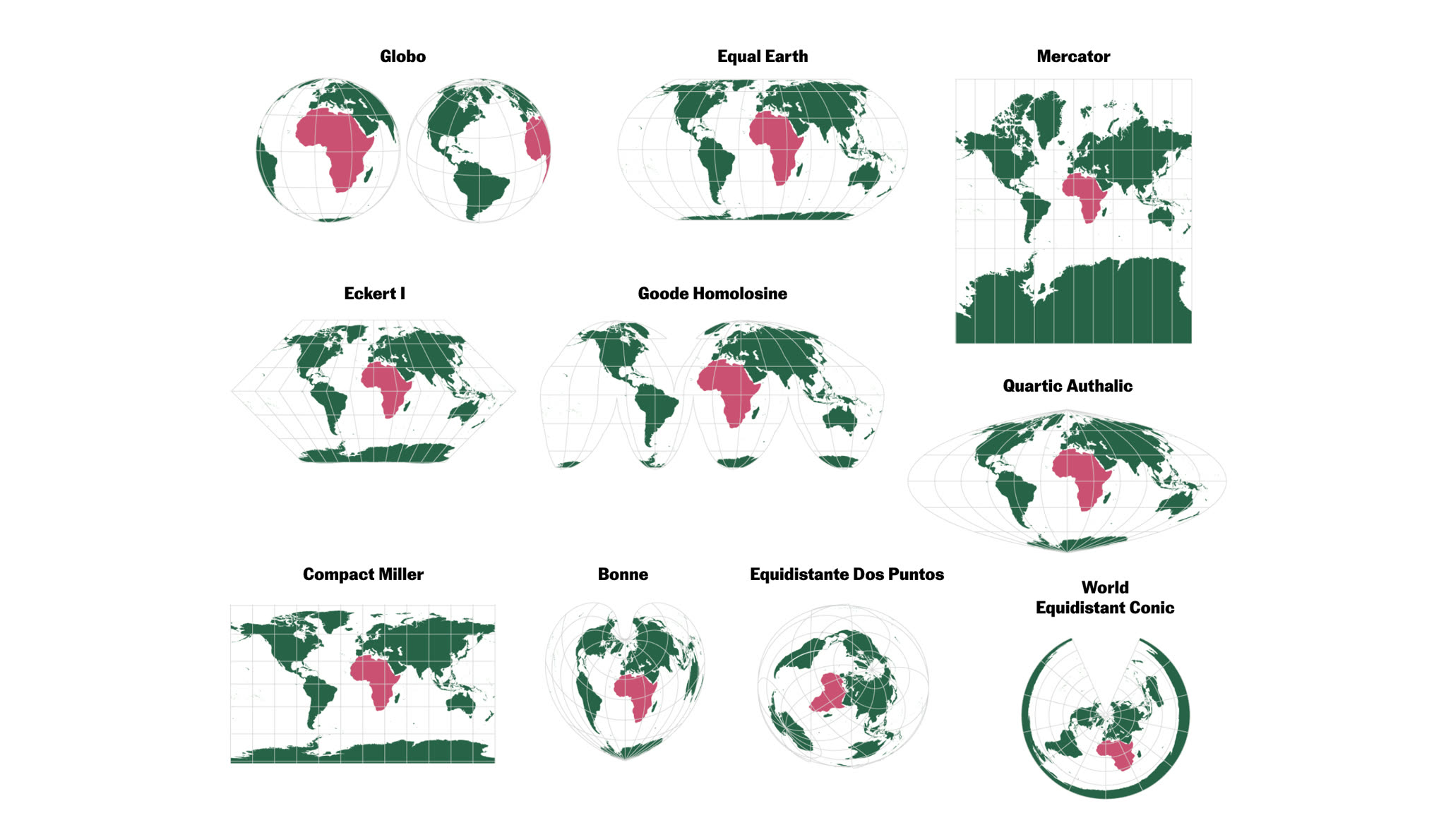
A cartographic explainer about the geometric problem behind every flat world map and the political implications of choosing one projection over another. The reporting followed the United Nations recommendation to move away from Mercator for general world maps, using that decision as an entry point to explain a broader idea: no projection is neutral, because every projection chooses what to preserve and what to distort.
The central editorial challenge was to make projection mathematics visible without reducing the story to a static before-and-after comparison. Readers needed to see that a world map is not simply a sphere pressed flat: it has to be cut, opened, stretched and reassembled. Mercator, Equal Earth and the globe therefore become successive states of the same surface rather than separate illustrations.
My role
- Cartography
- Data visualization
- Frontend development
I led the cartographic concept, the projection comparisons and the frontend implementation of the visual explanation. I designed the scroll narrative, defined the geometry and framing of each state, implemented the WebGL renderer, and tuned the responsive presentation so the same argument works on a full desktop canvas and a compact mobile stage.
The work also included translating editorial language into explicit visual states: when cuts become visible, when the surface unfolds, when Mercator appears, when Tissot indicatrices are introduced, and when Equal Earth and the final globe return must animate without asking the reader to infer a change from text alone.
Data and methodology
The interactive is built in Svelte and WebGL 1 with a single indexed GPU mesh. The mesh is divided into 12 longitudinal gores, each with its own seam vertices, so the Earth can open like an orange peel without recreating geometry or texture coordinates during scroll. A NASA Blue Marble texture is uploaded once, resized to a power-of-two texture, mipmapped and reused throughout the sequence.
The renderer interpolates the same geographic coordinates through several analytical and narrative states: a rotating sphere, cut and unfolded gores, an interrupted surface, a continuous plate carree intermediate, Mercator, Equal Earth and a return to the globe. Mercator uses its standard logarithmic latitude transform; Equal Earth uses its polynomial forward transform. Projection round-trip tests cover the numerical implementation alongside tests for framing, shell geometry and visual-state boundaries.
Tissot indicatrices are generated as a static GPU batch of identical geographic circles. Their deformation is not an overlay drawn by hand: the same projection shader that moves the land also transforms the circles. That makes the enlargement toward the poles in Mercator and the area-preserving deformation in Equal Earth directly comparable.
Key decisions
- Show the construction before the finished maps. The sequence starts with a globe, introduces cuts, opens the 12 gores, then stretches them into a rectangular world. This gives Mercator's distortion a physical explanation instead of presenting it as an abstract formula.
- Keep all deformation on the GPU. The application retains one indexed surface mesh, one texture and persistent GPU resources rather than allocating new SVG paths, canvases or geographic data on every scroll update. Separate passes handle the surface, shell, atmosphere and indicatrices while preserving exact seam behavior and a coherent texture across the animation.
- Use Tissot circles at the precise editorial moment they are introduced. They appear with the explanatory card, remain visible while Equal Earth changes their shape, and are rendered by the same projection math as the map so the visual evidence and the explanation cannot diverge.
- Treat the cards and the map as separate systems. Scroll sections still drive the geometry, but the visible card is fixed inside the scene and changes by active step, rather than travelling over the map. Desktop cards sit below the canvas content; mobile reserves a dedicated card area beneath the canvas. Both use short reduced-motion-aware fades.
- Frame the states independently. Globe, interrupted surface and analytical projections have very different extents, so the renderer calculates scale from the canvas aspect ratio and begins the zoom out early as the gores unfold. This avoids losing the outer segments at the viewport edge while keeping the globe legible.
Result
The final piece turns a familiar but easily misunderstood map into a visible transformation. Readers can follow a single textured Earth through the cuts and stretches that produce a world map, then compare the conformal logic of Mercator with Equal Earth's more faithful treatment of relative area.
The distortion is demonstrated rather than only stated: Greenland expands against Africa in Mercator, while the Tissot circles become increasingly large toward the poles; in Equal Earth, the circles no longer stay circular but retain comparable area. The final return to the globe closes the argument by restoring the surface that every flat projection had to compromise.
Impact and learnings
- The project makes a technical cartographic concept readable as a public-interest explanation about representation, power and geographic perception. It gives readers a way to assess map choices beyond the familiar claim that one projection is simply right or wrong.
- Technically, it also established a reusable pattern for high-performance newsroom scrollytelling: explicit scroll-driven visual states, persistent GPU geometry, projection tests, responsive framing and a card layer decoupled from the physical scroll triggers. That pattern can support future map explainers where geometry itself is part of the story.