Four maritime chokepoints putting global trade on edge
Context
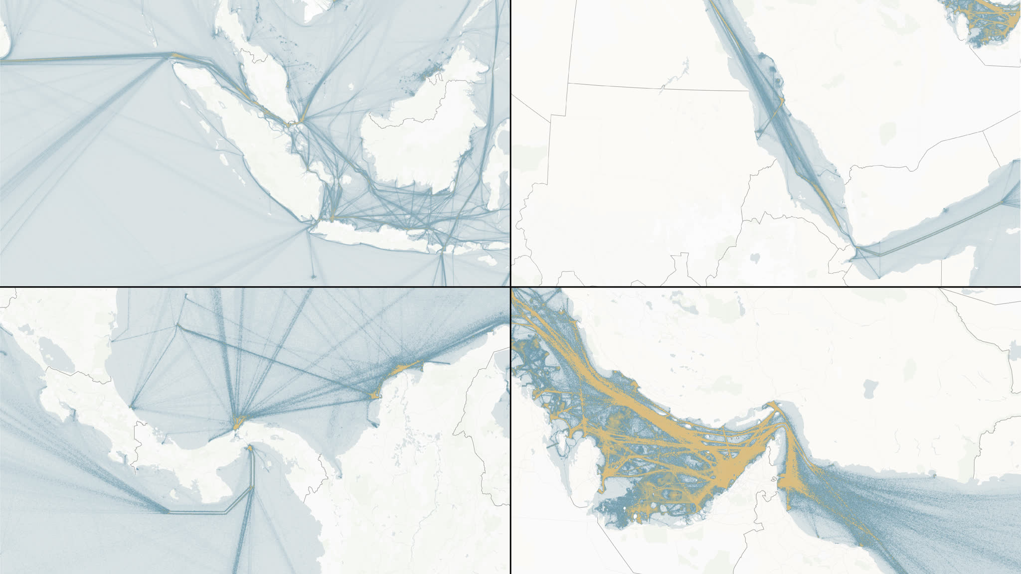
Global shipping is remarkably distributed until it reaches a handful of narrow passages. This rapid newsroom explainer for EL PAÍS follows four of them: Hormuz, the Red Sea route through Bab el Mandeb and Suez, Panama, and Malacca. A disruption in any one has a different cause, but the geographic consequence is the same: traffic, energy and freight are forced through a very small piece of water.
The challenge was not to make four location maps. It was to make readers feel the shared logic of a global network while preserving what is specific to each case: geopolitical pressure around Hormuz, attacks and rerouting in the Red Sea, drought at Panama, and the chronic concentration of traffic at Malacca.
My role
- Cartography
- Data visualization
- Frontend development
I shaped the cartographic language, built the scrollytelling map and implemented the supporting visual system. That meant deciding what each view needed to reveal, defining the camera choreography and labels, and turning the editorial sequence into a responsive MapLibre experience in Svelte.
I also prepared the map and graphic exports used across the article, keeping the live interactive and the static assets visually consistent under a tight newsroom deadline.
Data and methodology
The live map uses MapLibre GL JS with a globe-capable vector basemap served from PMTiles. A processed global shipping-density layer provides the network context; lightweight GeoJSON layers add the chokepoints, editorial labels and the few local annotations that the story needs. This kept the visual hierarchy deliberately spare: land and borders establish orientation, shipping density shows exposure, and annotations explain the event or constraint.
The narrative is data-driven rather than a collection of separate maps. Each editorial scene defines its camera, zoom, active chokepoint, label state and traffic treatment. The map remains mounted as the reader moves through text and charts, so transitions preserve geographic continuity instead of resetting the experience on every slide.
Key decisions
- Start with a rotating global view of the shipping network, then move into the four bottlenecks. The first view gives the local scenes their stakes before any individual place name appears.
- Use one restrained visual language across all scenes, but let the camera, density and annotation change with the editorial question. Comparability comes from the system, not from forcing every location into the same crop.
- Keep basemap labels selective and add custom labels only where the reporting requires more precision. This avoids turning a compact mobile map into a wall of names.
- Treat the map as a persistent stage for the whole story. Text and chart sections retain the previous geographic scene, giving readers time to connect the evidence to the place it describes.
Result
The final piece gives readers a quick route from a planetary-scale pattern to the geography of each bottleneck. Instead of presenting disruption as an abstract supply-chain problem, it shows the narrow channels, canal approaches and detours where pressure becomes visible.
The same map system could move cleanly between a global explainer, detailed local scenes and supporting charts while staying legible on desktop and mobile.
Impact and learnings
- A single, reusable MapLibre instance made the story feel continuous while avoiding the cost and visual jump of loading a new map for every section.
- The production showed how a small, explicit scene model can turn fast-moving reporting into a maintainable visual narrative: editorial changes land in data and map configuration rather than in a chain of one-off embeds.
- Most importantly, the format makes a systemic story tangible. Readers can see that global trade does not fail everywhere at once; it becomes vulnerable where the world is forced to pass through a few narrow corridors.